We’ve all heard the hype: AI is here, and whoever and wherever you are, it’s going to rock your ...


It’s important that we’re focused on being as effective as possible for our customers. So, let’s tap into our inner Frasier Crane and ask, How do we use design psychology to make our projects better?
First, let’s address the potential ethical concern you might have. When we’re talking about psychology and design, we’re not talking about trickery. We’re not trying to use psychology to make people do the wrong thing. We’re not trying to make a close button that actually opens something up or make a button that looks like an opt out button, but really it’s an opt in button. That type of stuff is really dirty and we don’t want to do that. All you end up doing is making your users angry.
No, we’re talking about looking at how human beings operate: how we think and how we process our daily world. We’re talking about making things better for them (and for you, because this is a symbiosis). If your website or app uses these psychological tenants in design, then it’s going to be more user friendly. Users will be able to accomplish their goals more quickly, and if users are able to do that, then they’re happier with you. And happy users means more customers.
Great design is unbelievably important. So I’m laying out Five Core Principles of Design Psychology to make sure that we’re doing the right thing for every audience.
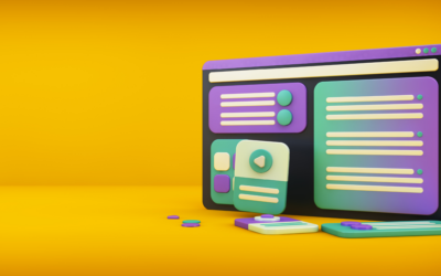
This is really just the concept of removing too many options, sometimes referred to a HICK’S LAW. Think about the last time you used a piece of software that you hated. Why did you hate it?
Yup – too many options. It is a common reason to hate a piece of software.
In Design Speak, Hick’s Law says that the more options you present to a user the longer it will take them to make a decision that’s bad for you. We get people to come to our sites, download our apps, to pick up our product in the store. We only have a few minutes, a few seconds even, for them to make the decision on whether it’s right for them. And if we don’t draw them a very clear path of what they should do, then you won’t get users, you won’t get leads. You will lose clients and customers.
We want to reduce the number of options that are available to a user. Make the path that the user should follow simple and clear. Very, very clear.
Making that path clear is about knowing your audience so you can segment them the right way. If you know who your audience is, or, in most cases, who your audiences are, you can have a lot of options on your landing page, but you can find ways to create separate blocks and segments for different audiences and customers.When you know your target demographics, you give them specific landing pages, tailored to meet their needs and answer their questions. This simplifies and focuses the design for those users.
This was coined by Jacob Nielsen, who is one of the first pioneers of the web when it came to UX and UI interface and design. JACOB’S LAW says that users have an expectation when they come to your website and they want your website to work as expected. If their expectations are met, then they’re happier and more likely to move forward with your product.
There are certain standards on websites that we’ve all become accustomed to.
Following these standards will helps users out and they’ll be happier because of it.
Of course, you don’t have to follow every standard, and even breaking patterns can draw attention in a good way sometimes. This leads us to Psychology in Design Principle #3.
The VON RESTORFF EFFECT basically means that the thing that stands out is the thing that’s going to draw my attention.
If everything on a webpage is blue and suddenly there’s a button that is orange, my eyes going right there to that button. That’s a great CTA (call to action). We use contrast to draw attention to the things we want the user to see. If everything look the same, they’ll get confused and won’t know what to do.
You can use this to great effect. It can be a color or a shape (or both) that stands out. Just make sure its something that’s a little bit different.
The Concept of Gestalt is a pretty big concept, and it actually has a bunch of sub laws, but I’m going to go through this really quickly for you.
A lot of people know the Concept of Gestalt as: the idea that our brain fills in gaps. The biggest way that people use this is called the Law of Closure.
Think about the IBM logo. Its actually a bunch of lines that make your brain fill in the gap to say IBM, right? The AT&T logo is similar; it has a whole bunch of empty areas and our brain fills that in.
Think about a dotted line that’s in the shape of a square or a circle. Is that a circle? No, it’s not really. It’s a bunch of dots and our brains fill in the gaps and makes a circle.
Why is this beneficial? Because when we solve these little puzzles and they’re not too difficult, they we see them as pretty and our brains are engaged. We’re not just passively looking; we’re actually actively paying attention and we get a little dopamine rush.
The Law of Similarity means that if things are similar, then we’re going to group them together. So rectangles are automatically grouped together and they’re kept away from circles, which are also grouped together.
This can be really valuable when it comes to interface designs a mobile application, a website, or a piece of software. It’s even valuable if you’re doing the interface for say, a remote control.
You can have different types of buttons mean different things. Maybe hard-edged buttons are always about going deeper into a product and rounded edge buttons are about the user’s profile. Again, there are certain norms and patterns that already exist with other products that can be valuable to maintain. You can use this to your advantage because when a user sees that rounded button, they think Oh, this must be about my profile. The instinctively know what that button is for.
The Law of Proximity is exactly what it sounds like. If items are near each other, we consider them to be a group, and if they’re apart from each other, we don’t. So three little circles and three little rectangles are seen as two different groups. And three three little circles in one area and three little circles in another area will also be seen as two different groups.

The best example of the Concept of Figure Ground is an optical illusion illustration. Remember the drawing of the duck and the rabbit? Look one way and its a duck; look another way and its a rabbit.
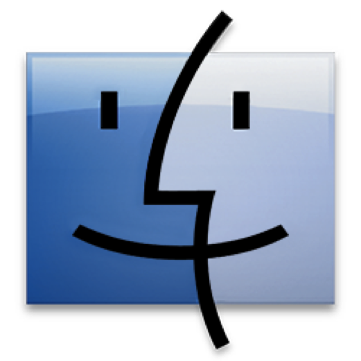
The Mac logo from years ago is fantastic to demonstrate this. The Mac logo is a smiley face, but if you look another way, it is two faces looking at each other.
How is this beneficial? Again, this engages us and gets our brains to work in interesting ways. We can’t see both at the same time and it always gives us a secondary meaning there.
![]() Think about the FedEx logo. There is obviously the word “FedEx,” but when you look at the letters between the E and X, you see a little arrow in the empty space. That arrow makes me think, Oh, forward movement. They deliver stuff. They must be speedy and quick. »But I don’t necessarily see that arrow first. I see the word “FedEx” and then I discover the little arrow and I’m impressed. Designers love that kind of stuff, and users love to find it.
Think about the FedEx logo. There is obviously the word “FedEx,” but when you look at the letters between the E and X, you see a little arrow in the empty space. That arrow makes me think, Oh, forward movement. They deliver stuff. They must be speedy and quick. »But I don’t necessarily see that arrow first. I see the word “FedEx” and then I discover the little arrow and I’m impressed. Designers love that kind of stuff, and users love to find it.
Our brains automatically assume that things will be symmetrical and that they will pivot around a center point. So, even if its not a complete circle, if it’s a partial circle, we’ll fill in the gaps using both closure and this expectation that things will be symmetrical.
You can use this here advantage by designing things that you want users to fill in naturally. You can also use it with the Von Restorff Effect: create something that’s asymmetrical or doesn’t quite work the way users expected it to, draw their eye to it and then boom, you’ve got their attention.
This fifth principle is really, really important, but I’m listing it last because it is so subjective. It is the idea of using color and visceral imagery to guide the user forward.
You might see a photograph of a crowded concert, and, to you, that may indicate fun, excitement, and energy, but to an introvert or someone afraid of crowds, it may indicate something overwhelming and scary.
Not all images mean the same thing to all people, but we do want to use imagery where possible. An image of happy smiling people on a website or mobile application makes us want to be that happy smiling person, right? The user can probably identify with the individual in that image, which is a good thing and indicates good design. But remember that images will not always have the intended effect; images are subjective.
Like images, color is subjective. For example, some people are color blind so red and green might look the same to them. That means if you have red “stop” button and a green “go” button on your website, it is going to look like the same thing to someone who is color blind. So instead of a red circular button and a green circular button, make the red button octagonal to mimic a “stop” sign and maybe add the word “Go” to the green button.
Use different icons and different images to support your design. Then, even if people do not interpret color the same way that you do, you will be giving them multiple means to interpret the design the way that you want it to be interpreted.
This is also very important when a product need to be multicultural. Green does not mean “go” in every culture. Blue does not always mean “peaceful. Yellow does not always mean “sunny.”
Plus, some people simply have different personal associations with different colors. For the longest time I just didn’t like the color green, so if someone used green in their product, I would instinctively look away from it. Those types of personal associations are out of your control, so bring context to the design and help the user understand the intended effect by backing it up with other Design Psychology Principles.
These Five Design Psychology Principles just scratch the surface. Understanding psychology and design in product building is a pretty big endeavor. Some people get PhDs for this, but these five Principles are ones everybody can grasp because we’ve all dealt with them. These are going to allow you to look at your projects and products and revaluate them; ask yourself, Where are we failing? Where are we succeeding?
See if you can apply these Design Psychology Principles to make your products clearer and more effective and to make your users excited to use your product.
If you need some help or want to talk to us more about Design Psychology, reach out. We’re always studying this and getting better because psychology and user expectations change. And we’d be happy to help you out.