We’ve all heard the hype: AI is here, and whoever and wherever you are, it’s going to rock your ...


One month into the new year, and we are keeping a close eye on the predicted web design trends for 2022. We’ve identified a few strong leanings we are seeing, but interestingly enough, the design landscape for 2022 is, in a word, eclectic.
As our Founder and Head of Product + Design, Q Manning, puts it, “More so than anytime before, there is not ONE predominant visual style driving graphic design trends. While things can be grouped together into similar buckets, it is absolutely staggering how many varying styles are considered acceptable and mainstream enough to be used on any type of project from Fortune 100 to Entrepreneur.”
Here’s our take on what we’re seeing and using in our own design spaces.
As proof, just look at all these popular, complementary, and even opposing trends we are seeing and can expect to keep seeing throughout 2022. Here’s our short list of top competitors:
See what we mean? It’s a bit all over the board, meaning you can likely find one design trend that is just your style! Go for it and don’t worry about being de rigueur. If you like it and believe your target audience will vibe with it, then jump on that design trend train and ride it home!
Amid the screen fatigue we’ve collectively suffered in 2020 and 2021, more designers are creating dark mode designs for their websites. Dark mode design offers a new look and design elements on a dark background. This is a welcome change to the standard white and blue light we are constantly staring at.
Dark mode can be a permanent part of the website design or an option for website visitors. Some websites offer a toggle switch to change over to dark mode for those who prefer to view their content this way. Either way dark mode on a website or app helps provide relief to our eyes and break away from eye strain, making this design trend one we hope will stick around for a while.
This trend goes along with that yearning for something less visually stressful. Black and white palettes are simple yet classic, evocative perhaps of a classic movie. Another benefit to simple and clean black and white design is that it allows other design elements to shine. Whether we’re talking about a drawing, a logo, and animation, or text, with a black and white design, those elements can stand out without competing.
We’ve all heard the saying “Less is more.” And today we’re seeing more and more logos are getting distilled to the simplest, most powerful elements of the brand, reflecting the essence of that quote. Consider the need to identify your brand quickly and easily at any size, on laptops, tablets, and PCs. Are there unnecessary graphic elements you can eliminate? Does your logo have shadowing or gradients that don’t add value to the design?
Again, simplification has been trending for a while now. Beware, however, oversimplification. Google and Firefox are two brands that oversimplified their branding to an extreme degree, leading to ridicule online. Remember, while simplifying is desirable in many ways, being distinctive and recognizable is still the ultimate goal for your logo and branding. Stay true to the feeling you want to convey, to how you want consumers to feel when they see your logo.
Using simple illustrations to make the complex look simple is popular now, and will remain so, for reasons we have already stated here. Simple illustrations and simple design, incorporating more white space is easy to read and less of strain on the eyes and brain. Simplicity done with style is the goal here. When you use fewer elements, each element needs to carry more weight.
Gold, copper, and silver always appeal, and 2022 will see these metallic colors stay top of mind for many web and app designers. Using metallics as the base, neutral colors and accenting them with pastels is an eye-catching, visually appealing design strategy.
Unlike other trends we’ve seen that scale things down visually, maximalism amps it way up! This ongoing design trend rejects the overly simple and focuses on excess. This design style will surely stimulate that frontal lobe. It’s brash, visually loud, with elements of bright colors, layered images, moving images such as animations, videos, or flashing components. It’s a bold statement, appropriate to artistic and bold brands.
Large titles and shortened messaging is what this trend is all about. Make it big; allow it to pop; easy to read. You can always add the details in subheaders or website copy. Just distill the brand or message to a clear and straightforward one and let the big, bold letters grab the attention.
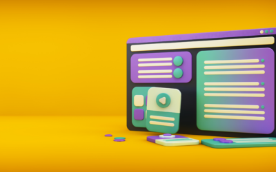
Let’s face it, 3D elements are simply cool. They add eye-catching detail to what can be an otherwise flat experience online. 3D isn’t new, yet it is reaching new popularity as more and more users have access to higher quality screens with greater capacity for viewing 3D animations. From geometric design features adding abstract flair to something brand specific or a web page greeting that pops, we haven’t seen the last of 3D images and animation for websites. Remember to consider that not all users may have fast enough internet to support complex animations, though.
As they say, “When you know better, do better.” Inclusive design in all elements is the way to go in 2022. It’s time. By including everyone, you are reaching more people and offering a better experience for all potential users. Accessible design focuses on users that have visual, hearing, or mobility challenges or impairments. However, keeping accessible design top of mind throughout the design process will make your website or app more easy to navigate for all users.
Some crucial points for accessibility include consistency of text formatting, use of headers, descriptive copy, use of alt text. Consider if voice search optimization is possible. Use high contrast between foreground text and its background for maximum visual accessiblity. Got videos? Use captions! Photos or images? Use Alt text descriptions. Consistent and intelligent UI design features help navigate the website or app and are crucial. Here is a COMPREHENSIVE PRIMER for designers on creating accessible websites.
Last but by no means least, this one should be a no-brainer in 2022, again with a nod and a cringing look back at all we’ve endured the past two years. People want more positive, uplifting, fun content. Enough with the judgy-judgy content designed to make you feel less than or lacking, enough with the snark. This is the era for feel-good content. Bring on the happy if at all possible.
This could look like bold colors, a joyful feel, and optimistic messaging. As DESIGNMODO puts it, “The common thread with these designs is that they inject a little extra happiness into the world.” Make feeling good the order of the day.
Have you updated your website to incorporate any of these design trends? We are happy to help if you are ready for a refresh or a whole new design! Our EXSQ designers live for this stuff! Contact us today if we can help your company grow with the times.